
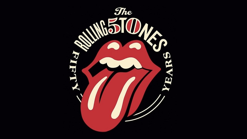
Con la publicación del disco “Sticky Fingers”, el primero editado bajo su propio sello el 23 de abril de 1971, The Rolling Stones presentaba al mundo su famoso logotipo de la lengua, que a través de los años se convirtió en el inequívoco símbolo que remite al popular conjunto británico sin necesidad de que medien textos, siglas o aclaraciones.
El célebre dibujo fue creado por el entonces estudiante de arte John Pasche y su inmediata asociación con la irreverencia y la sexualidad que vendía el grupo -tal vez por su semejanza con la boca del cantante, a pesar de que no había sido esa la intención inicial- hizo que fuera adoptado como un rasgo de identidad que opera casi con la misma fuerza que su música.
Cincuenta años después, no solo no existe ninguna otra banda que pueda presentarse a nivel gráfico solo con un símbolo en el que no está el nombre del grupo ni sus iniciales, sino que además ese logo de la lengua se ubica al mismo nivel de reconocimiento popular que otros que representan a famosas empresas multinacionales.
La historia se originó un año antes cuando Jagger tuvo un primer contacto con Pasche a fines de encargarle un diseño para un tour que realizaría la banda por territorio europeo, según recordó para Télam Diego Perri, uno de los máximos historiadores y coleccionistas en nuestro país de material sobre los Rolling Stones y autor del libro “República Stone”.
Conforme con el póster en donde aparecían un barco y un avión como símbolo de la gira, el cantante, acaso influenciado con la moda hindú instalada con el advenimiento del hippismo, le mostró poco después un afiche de la diosa Kali como ejemplo de lo que buscaba para un nuevo emprendimiento: “Jagger quería un logo como el de Shell, que supieras al verlo de qué se trataba”, puntualizó Perri.
Así surgió el famoso símbolo por el que la banda le pagó a Pasche 50 libras, que fue incluido en unas invitaciones VIP de un show que el grupo dio en marzo de 1971 en el club Marquee de Londres, en el marco de un especial para la BBC y que, un mes más tarde, iba a ser utilizado para identificar al nuevo sello discográfico del grupo.
“Alguna vez Pasche contó que las 50 libras le habían parecido buena plata porque nunca pensó que ese diseño iba a ser lo que fue, que iba a convertirse en el logo más significativo e importante del mundo, no solo hablando de bandas sino a nivel general”, recordó el coleccionista argentino.
Más allá de esta historia, hasta hoy existe una confusión generalizada que le atribuye a Andy Warhol la creación de la imagen de la lengua, debido a que el reconocido artista pop neoyorquino tuvo a su cargo el diseño de la portada de “Sticky Fingers”.

Incluso, la foto de tapa con el primer plano del cierre de un pantalón de jean masculino a punto de abrirse fue tan provocativa y trajo tantos problemas operativos en la primera tirada del disco que la imagen de la lengua pasó desapercibida al momento del lanzamiento del disco.
Ocurre que aquella primera edición incluía un cierre verdadero que invitaba a ser bajado con la latente amenaza de que quedara expuesta la anatomía de Joe D´Alessandro, el anónimo ayudante de Warhol que ofició de modelo; pero debió ser retirada de la venta porque el dispositivo rayaba en muchos casos los vinilos que estaban dentro de la funda.
“En la edición original, en la contratapa había una foto de un calzoncillo, pero acá en la Argentina se lanzó en asociación con la marca de jeans Levi´s así que aparecía el logo de esa marca al dar vuelta la tapa”, comentó Perri.
Tras aclarar que en realidad se trata de un isotipo y no de un logotipo – como se dice habitualmente- por la ausencia de letras, y advertir que “más irreverente que esa imagen resulta la tapa del disco por lo que propone la apertura de esa bragueta”, el músico y diseñador gráfico Javier Veraldi ofreció a pedido de Télam algunas precisiones en torno a la creación de Pasche.
“Pertenece a la estética del momento en que se hizo, una época en donde se creía que el mejor diseño tenía que ser lo más sintético posible, casi pictogramático”, comentó el diseñador que desde su estudio Planta Baja C creó portadas desde los `90 para innumerables discos.
Y agregó: “Ahora tal vez sí porque está muy instalada, pero en su momento no era tan pertinente la imagen con a quien representaba. Es decir, si no conocías a la banda y yo te decía que era un logo para una pasta de dientes, podía ser. Eso está bueno”.
En tal sentido, Veraldi consideró que por su impronta pop asocia más el dibujo con sonoridades presentes en temas como “Miss you” –un guiño de los Stones a la moda disco- que al tradicional estilo rockero del grupo. “Yo lo asocio más con los trabajos de Lichtenstein o con las sopas Campbell de Warhol, una crítica a la sociedad de consumo”, apuntó.
“Esta imagen tiene síntesis. Por otra parte, es provocativa por metonimia. Al tener la lengua afuera quiere decir que hay un movimiento que es el de sacar la lengua. ¿A quién le saca la lengua? ¿Qué le dijeron para que saque la lengua? Y también hay metáfora porque no hay una guitarra o un micrófono, así como si fuera algo referido al deporte podría haber una pelota”, analizó.
Actualmente, el original creado por Pasche se encuentra en el Museo de Arte y Diseño de Londres (conocido como el Victoria & Albert) luego de haber sido adquirido a su autor en 2008, quien esa vez sí pudo percibir una cifra un poco más jugosa que en 1971.
“Lo más curioso es que Brian Jones, uno de los fundadores de la banda, nunca conoció el logo de la lengua porque murió en 1969. Y además era el miembro del grupo que más enganchado estaba con la moda hindú”, comentó, a modo de conclusión, Perri.
Pero tal como remarcó Veraldi, “los logos los hace la gente” y lo ocurrido en estos 50 años con la lengua Stone es la prueba cabal de cómo un dibujo sin más pistas que una boca sacando la lengua sea sinónimo de Jagger, Keith Richards y compañía, y haga sonar en la memoria auditiva los riffs de “Satisfaction”, “Start Me Up” o “Honky Town Women”. (TELAM)